Monday, March 30, 2009
It's Otter Time!
I realized it's about time to release my otter collage that I designed and taught at EGA's Greater Pacific Region seminar in Asilomar, California.
If you're an otter lover, this project is for you! It's called PACIFIC COAST COLLAGE and features a smiling otter
a bright Monarch butterfly
and some dimensional shells (worked in bullion knots.)
Please visit my website for more details about this design.
Saturday, March 28, 2009
My Glass Jewels
Once in a while, I get the urge to pull out my fused glass materials and make a batch of fused glass "jewels" in my tiny jewelry kiln. They're very fun to make, and I like looking at the surprise "jewels" that are created. I've always thought they'd be great accents on needlepoint projects; and indeed, that was the reason I bought the small kiln many years ago.
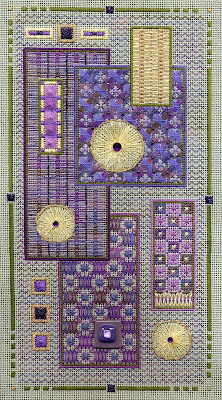
I've only used the jewels on a few projects. It's harder than I thought to a) mass-produce lots of the same jewels, and b) create just the right jewels for certain projects. One of the best uses of fused glass jewels happened in my PURPLE PANELS design. Here's the whole design, which works vertically:
or horizontally:
I wanted to create something elegant and abstract, that could also incorporate a fused glass jewel in the design. And all of the blocks of patterns were really fun to stitch up.
This design also uses one of my favorite design tricks: I pick a variegated thread color I like, and then stitch it with several different colors to see how the variegated colors change when they're mixed with different solid colors. The Waterlilies' color I used here was 06 - "Amethyst" because it has such a yummy mix of blues, purples and greens. Here you can see it mixed with DMC 340, periwinkle blue.
The orchid colors you see above (DMC 552 & 553) are used again in the lower boxes. And they pick up the amethyst colors in the attached fused glass jewel as well.
All in all,
this is another one of my favorite pieces, and I never tire of looking at the different elements that make up this sophisticated abstract design.
Monday, March 23, 2009
Wait! There's More...
Quite a while ago, in a previous post, I showed you the borderwork on a small California Poppy piece that I use as a teaching/class project. Now, I want to show you how I've slightly modified that border for a companion piece. Same pattern, different flower, -- and a different colorway.
This time I stitched up some lilacs:
Unlike the poppies, where both borders were stitched with the same dark green, I stitched the inner border with the lighter green and the outer border with the darker green. It creates a bit more drama and dimension - just by changing the colors slightly. Keep that in mind.... next time you want to add a border (or repeat one) think about altering the color just a bit, to create extra richness.
While we're on the subject... I also stitched this pattern in a wine country version, called GRAPE HARVEST, using an autumnal color palette:
In this teaching design, I took the lilac flowers of the upper design, turned them upside down and altered them slightly to turn them into grape clusters.
Same design composition, just different botanicals and very different color palettes. And what a different "feel" each design has!
(And oh yes, in case you were wondering, I've already started yet ANOTHER variation of this design, using soft pastel colors for a sweet summertime flower..... but you'll just have to be patient and wait and see what I come up with!!)
Friday, March 20, 2009
Happy First Day of Spring!
Thursday, March 19, 2009
My Green & Purple Finish
Well, I've finished my green & purple "fun" project: the Happy Birthday sampler from Blackbird Designs.
I've made a few changes to the pattern (slightly changed the verse, shorted the overall length, moved the little houses at the bottom) as well as employed a few easy needlepoint stitches to complete the piece quickly, rather than working the whole design in cross stitches.
Here's a close-up so you can see what I've done:
Instead of cross-stitching the zig-zag border around the verse, I just used diagonal long stitches, then filled them in with little straight stitches in the variegated floss - so the border had a bit more color (well really, I just wanted an excuse to show off more of the yummy variegated colors of Waterlilies' "Hyacinth".).
You can also see what I did to my FAVORITE part - the thistle flowers. I just made them with diagonal long stitches, to give them a bit more puffy dimension and color.
And the rest of the piece was stitched with fast and easy half cross stitches - or a variation of the tent/continential stitch.
Tuesday, March 17, 2009
Celtic Cross #2
In my second Celtic attempt, I wanted to try using blackwork to create a special Celtic design.
This is my CELTIC CROSS #2:
I actually designed the piece around an "emerald" button I found in a fabric store. At the time, there were many Celtic-type buttons to choose from, and I liked this antique-looking green button.
I settled on this simple, but most effective composition of an actual Celtic cross layout. And I was very careful to choose blackwork patterns that looked "Celtic" to me. Here are the ones I used in this design:
As you can see in this photo, the actual patterns I stitched in the arms and center areas all have some variation of the larger celtic cross shape within their repeating patterns. This "echoing" of shape and motif re-enforces the overall Celtic theme and also works to tie all the different areas together. In the corners, I've added some large Waffle stitches in a thicker gold cording, as another "echo" of Celtic knotwork. Overall, I was pleased to create a modern blackwork piece that also had the feel of something quite ancient.
I used one ply of dark green DMC floss along with green and gold blending filament, throughout the whole piece, which is stitched on 25 or 28 ct. Lugana (I forget which). Unfortunately, photos never show the dazzling sparkle of metallics in a stitched piece. But trust me, this piece REALLY has lots of green and gold sparkle! It's a favorite blackwork piece of mine, and one I enjoy looking at every day.
Monday, March 16, 2009
Celtic Cross #1
I thought this week would be the perfect time to show you the other two Celtic designs I've done. Here's the first one, a very early design called CELTIC CROSS #1.
This was done MANY years ago, and was stitched all in cross stitches (with a few satin-stitched borders) on a natural-colored linen. I particularly wanted to try and replicate the shadows of the interlocking strands, so making the overall design look three-dimensional was a challenge. Here's what it looks like up-close:
Like so many other stitchers, I too am fascinated with the intricacy of celtic design. This was my first attempt at interpreting that ancient and most beautiful art.
Friday, March 13, 2009
A Simple Gift (in green & purple!)
Sometimes the simplest things can give the greatest pleasure.
I was reminded of that when I pulled out a small pillow I made many years ago, when I first started designing my needlepoint quilts. I had forgotten all about this little pillow, but when I saw it again, I still thought it was quite charming.
That's one of the nice things about those classic, traditional quilt blocks -- they certainly stand the test of time! And this little Lone Star block is one of my absolute favorites. How can anyone resist the beauty and simplicity of these stars?
Here's an up-close look at the Lone Star blocks:
As you can see, it was stitched with a "green and purple" thread - probably Watercolours' "Amethyst", which is one of my favorites.... and it's apprx. 3.5 x 3.5" on 18 ct. mono canvas. And hey, there's not even a border around this! (Which only goes to show how unnecessary borders, metallics, beads, or fancy stitches can be when something is a classic like this Lone Star block.)
Anyway, I was smitten once again with this little pillow, and decided to quickly graph it out to share with you. Please visit my website and click on the FREE PATTERNS page, and you'll be able to copy this "SIMPLE GIFTS" pattern. And, if you look at the top photo, you can also see how EASY it is to make a little pillow with this design. I used some odds & ends purple corderoy scraps - it was easy...really!
Anyway....this pattern is my St. Patrick's Day gift to all of you stitchers out there... Enjoy the stitchin' of the green (and don't forget a bit of purple!)
Wednesday, March 11, 2009
My Green & Purple Project
One of the best things about reading stitching blogs is: you can get inspired to stitch something you would have never otherwise attempted, just because you see someone stitching it on their blog. Such is the case with my current "fun" project.
I became absolutely smitten with the "Strawberry Basket" pattern the SPINSTER STITCHER was working on recently, and followed her growing progress with great anticipation. I just loved seeing the little lazy daisy leaves, the blushing red berries, the randomly placed alphabet grow on her fabric. AND I WANTED TO STITCH THAT PATTERN TOO!
You see, reading Coni's blog got me all excited about Blackberry Designs, a design company I had never really LOOKED AT very closely. But once I read Coni's enthusiasm for her project, it got ME excited too. And so I did some exploring on the internet to see what other designs were available from Blackberry Designs -- and along the way, I found lots of other stitchers working on more of those designs.
Well, by then I figured a trip to the stitchery store was needed.... So I went to my local stitchery store to peruse their cross-stitch pattern section. There were several patterns from Blackbird Designs, and the one I found (instead of the strawberry one) was a lovely faded purple and goldish green sampler called "Happy Birthday." Oooooh, that was lovely too - and it perfectly fit my green & purple mood....
Well, of course I've changed a few things..... First, I'm stitching it on 24 ct. cream Congress Cloth. I love cross stitch, but don't have the time/patience to do all those little xxxx's. So I substitute half-xxx's instead (which I figure saves me half the stitching time!) Here's what I've stitched thus far:
I'm using some Overdyed Floss in a suitably faded taupey grey/green and thistle purple. I've also got a bit of Waterlilies, "Hyacinth" for accent (I've stitched the bird - and the ric rac border around the verse with Hyacinth straight stitches to give it a bit more border color), plus a very subdued Sparkle Rays metallic for the little stars sprinkled thruout the design.
And I'm NOT including the big initials or the Happy Birthday script at the bottom of the verse. Instead, I've slightly altered the verse to fit in the space, which makes the box shorter and the birthday verse becomes a more universal blessing that will fit nicely with my other samplers.
I'm ready to fit the rest of the thistles on the side, plus add the cute little houses on the bottom. And then I'll be done with my new little old-looking green & purple project! How fun is that?!?
[Aside to SPINSTER STITCHER Coni: Many Thanks, Coni, for stitching that Strawberry Basket so beautifully in the first place, and getting me jazzed about a new project. I'll be sure to look for more Blackbird Designs in the future, thanks to you!]
Monday, March 9, 2009
March Comes In....
Here in Northern California, March came in like a lion.... with lots of wind and rain. Was it the same where you live?
Because I tend to think of things in terms of colors, I always think of March
as being a "green & grey" month. (Days of the week have certain colors for me, too, but that's another topic.) Anyway, around this time of year (also around St. Patrick's Day, not surprisingly) I get a craving for stitching something in greens and purples.
Here's a few of my past green & purple designs:
This is GARDEN PARTY, a geometric sampler which I've also used as my March banner heading photo, above.
Here's CELTIC KNOTS, a more traditional quilt design from my American Quilt Collection:
Here's a more elaborate comtemporary quilt design called COLOR STUDY: PINWHEELS:
And here's a completely abstract green & purple design called PURPLE PANELS (It's a particular favorite of mine, and I'll have to show it to you "up-close & personal" another time, so you can really SEE it better):
Maybe seeing all these designs will inspire you to celebrate the month of March by stitching something green & purple yourself! ..... As for me, I'm thinkin' it's about time to start another green and purple project...
Friday, March 6, 2009
Another Hardanger Piece
Here's a companion piece to the WILDFLOWER SAMPLER I showed you previously. It's called BLUE RIBBON SAMPLER.
It features a totally different Hardanger motif in the center, with more blackwork elements, wrapped roses, and a slightly different ribbon border.
Again, it's stitched on ivory 24 ct. Congress Cloth, with a pale variegated thread - Caron's Wildflowers, 147, "Winter Sky." I particularly liked the blues and peaches in this soft colorway, and it really was the inspiration for the whole piece. [By the way, the Wildflowers thread is a soft, single-ply cotton with a matte finish, and very lovely to work with. It works perfectly on 24 ct. Congress Cloth, and it's nice because you don't have to lay multiple plies. You can, of course, also use 12-ply silk or 6-ply cotton floss on this project as well.]
Here's the center Hardanger motif:
You can see how nicely the diamond-shaped rows of klosters look like little flowers. Again, I used #8 and #12 pearl cottons for all the solid colors. And look how nicely the variegated thread shows off its colors as the straight-stitched frame around each Hardangered block. And notice those little eyelets that are used for flower centers in the outlying blackwork flowers....aren't they a good (and easy) way to create a little bit of texture?
And here are the various blackwork elements, as well as the sweet ribbon border (notice those little eyelet flowers mixed with the blackwork foliage):
I like the soft, faded colors in this piece, as well as how "traditional" it feels...it looks like an old-fashioned design, yet if you changed the colors - say, to bold reds and greens on a white canvas - it would look totally different.
I also like to mix & match different stitching techniques in one piece (or maybe you've already guessed that, huh?) I'm always curious to see how things looked mixed together: Hardanger and blackwork, variegated colors and solids, simple and complex stitches. The challenge is creating a balanced piece, where every element fits with all the others, so the piece is not only fun to stitch, but also remains enjoyable to look at long after you're done.
Wednesday, March 4, 2009
More Organization Ideas!
This is for all you Stitchy Stash Organizers out there....
(and you know who you are!)
Have you ever thought about keeping track of the different threads you use on each project? If you're the type of stitcher who keeps a journal with all of your stitched projects, maybe you should consider keeping little thread snippets along with your written entries. It might come in handy when, say a few years down the road, you decide to stitch a canvas or chart with those yummy colors you hand-picked for an earlier project. Now, which blue did you use that matched your sofa exactly?? If you had kept a thread card with the ACTUAL threads you used, you would have a much easier time locating the right threads.
Or how about this scenario: you want to use a fuzzy, textured thread but don't want to use that particular thread that drove you crazy...which thread was it that you SWORE you wouldn't stitch with again?!? Well, if you made thread cards for each of your projects, you'd be able to find out.
As a designer, I've found it's extremely useful to have access to the actual threads that I used on each project. I can't tell you how many times I've gotten calls or emails with queries about project threads; and in many cases, when threads have gotten discontinued, I'm asked to find substitute threads.
So, I've developed my own system to keep my projects organized with their respective threads: I make a Thread Card. I always make my Thread Cards at the end of the project, when all stitching is done. Just before I put all my threads back in their respective drawers, I cut and tape snippets of each thread to the card. It gives me a great sense of security to know that I have each project's thread palette in an easily accessible place, should I need to refer to it in the future.
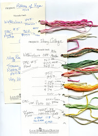
Now, I must confess to you: my cards are rather a mess - not neatly scripted by any means. And I'd like to say that I have them neatly organized in a pretty binder..... but I don't. Rather, I keep them in a scruffy shoe box on a shelf. And let me tell you, I'm rummaging thru that box more times a week than I can count.... so they're definitely a functional tool that works for me.
Anyway, I thought I'd share this organizational idea with you, just in case you've run out of things to do and/or organize in your stitching life!
[Aside: In case you were curious: I found the blank/lined journals in the top photo at several discount places - Office Depot, Marshalls, Ross, TJ Maxx. Browse their book isles and you can sometimes find great journals to write in....]
Monday, March 2, 2009
Hardanger Wildflowers
A while ago, I showed you a few Hardanger valentines.
Well, it got me to thinking about another Hardanger project I designed several years ago for Nordic Needle. It's called WILDFLOWER SAMPLER.
I've always liked the delicacy of this piece. It's stitched on ivory 24 ct. Congress Cloth, and the finished design size is 10" x 10".
Initially, I wanted to do a bit of Hardanger, but also I wanted to incorporate a variegated thread (naturally), as well as some soft springy pastels. I ended up using Caron Collection's Wildflowers (a single-ply, matte cotton) in 088 - "Mountain Meadow" (one of my favorite colors, since it has a lovely mix of pinks, yellows, blues and greens). Along with #8 and #12 pearl cottons in soft pinks and greens. I even added a sprinkling of pink beads for added texture.
The Hardanger medallions in this piece always remind me of little flower bouquets, especially when the kloster blocks are stitched to look like flowers. As you can also see, I added some pink wrapped roses, to add even more flowers to the design.
And, as I was designing this piece, I thought I'd add some floral blackwork motifs as well...(why stitch just one technique, when you can add two or three more, for a little stitching variety?!?)
And to finish it off, a ribbon border that has a bit of blackwork and a few wrapped roses, too.
I don't think Nordic Needle carries this pattern any more. So check my website, under the Sampler Collection and you'll see it there.... (Now that I look at it again, I'm thinking it would sure look awfully pretty in pale lavenders and greens, perhaps using Wildflowers' "Lilac" or "Pale Lilac"....What do you think?)